swell real estate company:
swell is a local real estate company that expanded quickly. Initially they wanted a logo for their charity. Soon after, they expanded into several different markets and needed quick, uniform branding for each.
swell gives back

swell - Elizabeth City, NC

swell - Hampton Roads, VA
swell - Richmond, VA

swell - Williamsburg, VA
Theatre:
It just occurred to me how much theatre work I do. It's... a lot. These are always fun to do. I get to throw more artistic elements behind the logo itself.
1619 When Destinies Collide - The story of the first Africans in North America
Contraband - The upcoming sequel to 1619
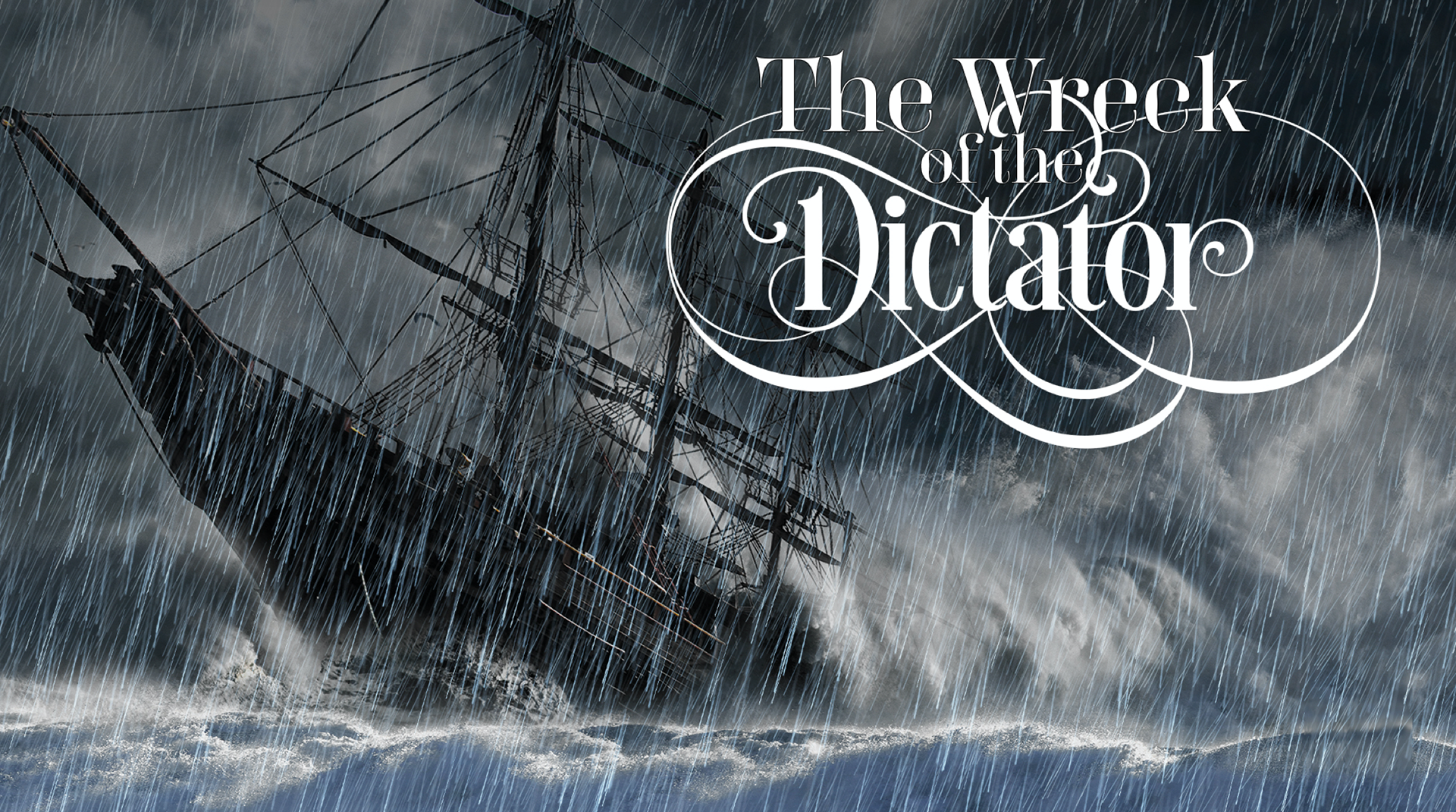
The Wreck of the Dictator - The story of a shipwreck off the shore of Virginia Beach
The Witch of Pungo - The story of Grace Sherwood
Virginia Legends Live - A limited show that combined the musicals of the legends of Virginia Beach

The Dance - The story of God's divine plan
The Odessa Lake Volunteer Fire Department Christmas Pageant - A Christmas variety show set in snowy New England
Western Branch Intermediate:
A school in Chesapeake, VA that was tired of their teddy bear image. The bruin can be a fierce creature, so they wanted to be somewhere in-between ferocious and cuddly. The motto is the principal's mantra for the school and he really wanted the B.I. initials sandwiched in the "WE." I tried to talk him out of it, but I learned a long time ago not to argue with the principal.
Phoenix Equipment:
A new heavy equipment company in Hampton Roads. They wanted bold and solid. Then bold and solid is what they get. They love it. Put it on everything. Their trucks and apparel is one thing, but I had to talk them out of heavy duty stickers because I just knew they'd end up on drive-thru speakers and stop signs.

The Bridge Café:
At one point, this was the greatest coffee shop in Virginia Beach located inside London Bridge Baptist Church. It was so good that I'm setting apart from the rest of the work I did for the church. The logo, like the café, combines boldness, elegance, and handcrafted elements. If I close my eyes I can still smell the espresso.
London Bridge Baptist:
I have a lot of work from this church. Mostly because I was the Director of Media and Publications. As a large church, we had many ministries who wanted their own identity.
Small Groups - Logo and App icon

Children's Ministry Logo

Missions Logo

Recovery Ministries Logo
Student Ministries Logo
